-
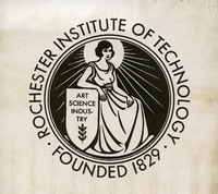 Current RIT Seal
 The current official RIT seal, which has the highly limited use on official diplomas. This seal is incredibly similar to the RAMI seal of the 1930’s, featuring the same woman, shield, and slogan of “Art, Science, Industry”. Very minor changes have been made beyond the change in school name, primarily the border has been modified to exclude the most outer circle. The foundation date was also moved to below the logo rather than inside, and the font type changed to a bolder, sans-serif type.
-
 Reporter Magazine Nov. 10th 1967 Frontpage Article
 A front-page article that covered the results of the repeal case for the new graphic mark created by Roger Remington. The issue was tabled by the Senate until Remington’s appearance, who then went on to explain the logo and its design. Remington successfully defended his logo, and thus it remained official.
-
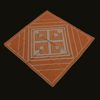 RIT Graphic Mark Scarf
 In 1973, RIT decided to update the “square-notch” logo. The logo was re-designed to consist of multiple lines that created the same square shape of the previous logo with the corner cut out. The new logo design allowed for the use of alternate colors beyond the orange and brown previously used in the Roger Remington logo.
-
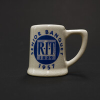 Mary Anne Cross Ehasz’s Senior Banquet Mug
 Very small mug in stature, light tan colored with blue text on the front depicts the logo as well as “Senior Banquet, 1957.” The logo printed on the front is a reproduction of Mary Anne Cross’ logo which she designed before she graduated in 1956 with an A.A.S. Degree. This mug was given to Cross as a souvenir with a B.F.A Degree in 1957.
-
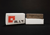 Miniature Souvenir RIT Brick 1968
 Numerous miniature bricks like this one were handed out to tours and students to celebrate the new Henrietta campus that RIT moved to in 1968. The brick itself was made of the same patented mixture that all other bricks at RIT are made of, making it an identical miniature of the 7.5 million bricks that were used to create the new campus. The packaging containing the brick featured the new RIT logo, making it one of the earlier souvenirs to display the newer logo as well as the new colors adopted by the school.
-
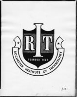 1948 RIT Symbols
 World War II brought about an upsurge in American patriotism, and the RIT logo reflected that. The school went through various logos during the war, most featuring an eagle, others featuring an industrial backdrop. An interesting variant of the RIT logo appeared later in 1948, one that took inspiration from the Coat-of-Arms used by Great Britian. This logo was used solely for the year of 1948, and the reason for the change is unknown. After 1948, RIT reverted to using the industrial-themed logo up until 1956.
 Current RIT Seal The current official RIT seal, which has the highly limited use on official diplomas. This seal is incredibly similar to the RAMI seal of the 1930’s, featuring the same woman, shield, and slogan of “Art, Science, Industry”. Very minor changes have been made beyond the change in school name, primarily the border has been modified to exclude the most outer circle. The foundation date was also moved to below the logo rather than inside, and the font type changed to a bolder, sans-serif type.
 Reporter Magazine Nov. 10th 1967 Frontpage Article A front-page article that covered the results of the repeal case for the new graphic mark created by Roger Remington. The issue was tabled by the Senate until Remington’s appearance, who then went on to explain the logo and its design. Remington successfully defended his logo, and thus it remained official.
 RIT Graphic Mark Scarf In 1973, RIT decided to update the “square-notch” logo. The logo was re-designed to consist of multiple lines that created the same square shape of the previous logo with the corner cut out. The new logo design allowed for the use of alternate colors beyond the orange and brown previously used in the Roger Remington logo.
 Mary Anne Cross Ehasz’s Senior Banquet Mug Very small mug in stature, light tan colored with blue text on the front depicts the logo as well as “Senior Banquet, 1957.” The logo printed on the front is a reproduction of Mary Anne Cross’ logo which she designed before she graduated in 1956 with an A.A.S. Degree. This mug was given to Cross as a souvenir with a B.F.A Degree in 1957.
 Miniature Souvenir RIT Brick 1968 Numerous miniature bricks like this one were handed out to tours and students to celebrate the new Henrietta campus that RIT moved to in 1968. The brick itself was made of the same patented mixture that all other bricks at RIT are made of, making it an identical miniature of the 7.5 million bricks that were used to create the new campus. The packaging containing the brick featured the new RIT logo, making it one of the earlier souvenirs to display the newer logo as well as the new colors adopted by the school.
 1948 RIT Symbols World War II brought about an upsurge in American patriotism, and the RIT logo reflected that. The school went through various logos during the war, most featuring an eagle, others featuring an industrial backdrop. An interesting variant of the RIT logo appeared later in 1948, one that took inspiration from the Coat-of-Arms used by Great Britian. This logo was used solely for the year of 1948, and the reason for the change is unknown. After 1948, RIT reverted to using the industrial-themed logo up until 1956.