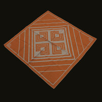
RIT Graphic Mark Scarf
Item
- Title
- RIT Graphic Mark Scarf
- Description
- In 1973, RIT decided to update the “square-notch” logo. The logo was re-designed to consist of multiple lines that created the same square shape of the previous logo with the corner cut out. The new logo design allowed for the use of alternate colors beyond the orange and brown previously used in the Roger Remington logo.
- Creator
- Logo by Roger Remington
- Source
- RIT Archive Collections
- Date
- 1973
- Rights
- RIT Archive Collections
- Type
- Physical Object
- Item sets
- RIT Graphic Marks
- Media
 RITScarf(compressed).jpg

